Sauce
Mobile App & Responsive Site
The Product:
Designing a mobile app and responsive website that will streamline signing up for services, donating, and/or volunteering for Sauce Milwaukee, a non profit that makes and delivers vegetarian meals to those in need, especially in areas that are food desserts. Meals are made from donated food and delivered on bike.
Project Duration:
Approximately 3 weeks
My Role:
-
UX Research
-
Information Architecture
-
UX Design
My Responsibilities
-
Planned & conducted user research and competitor analysis.
-
Interpreted data and qualitative feedback.
-
Created user stories, personas, and storyboards.
-
Determined information architecture and created user flow.
-
Created prototypes and wireframes.
-
Conducted usability testing.
-
Finalized high-fidelity prototype.
Overview
Background
My final class project was to be a mobile & site combo with the requirement that it be for social good. Rather than using a prompt generator, I reached out to local organizations I align with to see if they could benefit from my skill set. Sauce came forward.

Goals
To design a system that makes it as easy as possible to sign up to volunteer, to receive food, to get involved and contribute to Sauce.
Problem
The current system is all done via email, which is far from efficient.
Understanding the User-
-
User research
-
Personas
-
Problem statements
-
User journey maps
Summary
As this project is an actual organization, my research process involved looking at the current processes and listening to all those involved. In addition to this, extensive online research was done, along with a very thorough competitor audit.
Using all the information obtained, personas were created, pain points were identified, and the needs of what the app should entail were formed.
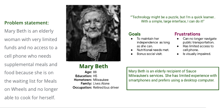
Persona: Mary Beth
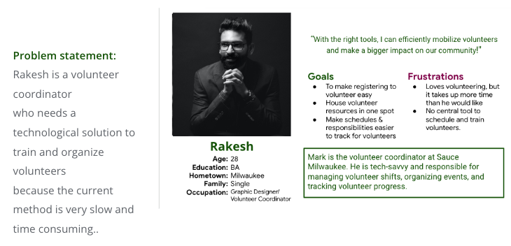
Persona: Rakesh
Competitive Audit
Given the common goal of feeding those in need, I didn’t look at this so much as a competitive audit, but more of a friendly review of how they do things.

Ideation
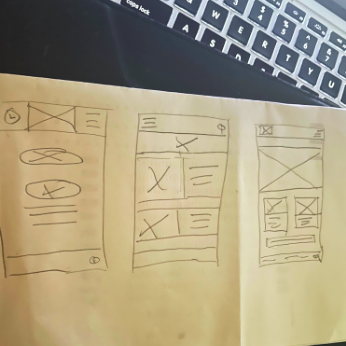
While statistically, more people would be accessing Sauce via the website, I began with designing for mobile. The reasoning was to make sure it is as accessible as possible, so doing so on the mobile then scaling up would insure maximum accessibility.
Starting the Design-
-
Digital Wireframes
-
Low-fidelity Prototype
-
Usability Studies
Digital Wireframes
Given the large range of target users, it was important to keep the least technically advanced at the forefront of the design. The goal was to make the design as simplistic and easy to navigate as possible.
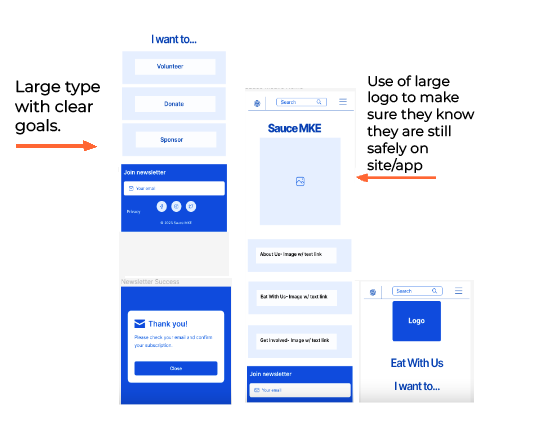
Low-Fidelity Protoype
Usability Study: Parameters
Study type:
Unmoderated usability study
Location:
US, Remote
Participants:
7 Participants
Length:
30-60 minutes
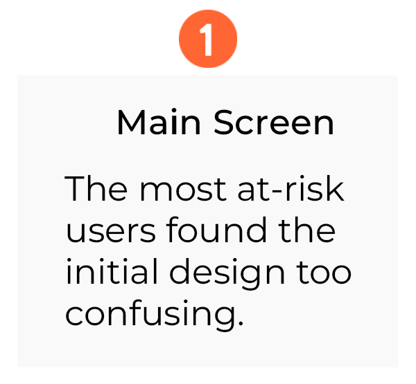
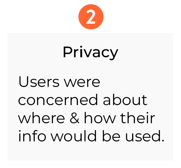
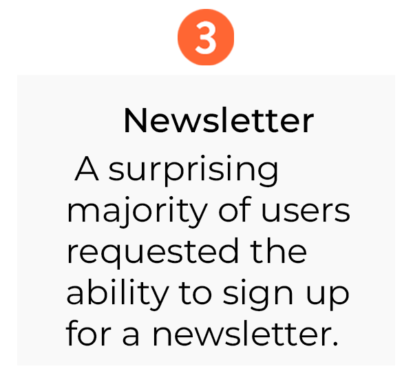
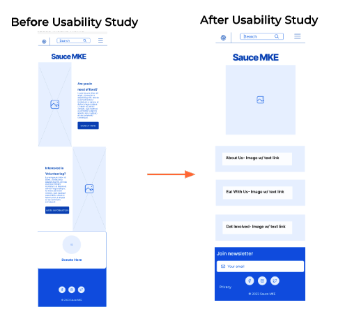
Usability Study: Findings
Refining the Design-
-
Mockups
-
High-Fidelity Prototype
-
Accessibility
Mockups
Reiteration
As the main goal is to make signing up as accessible and thoughtful as possible, design input was implemented and I changed the wording a bit to assist with reaching those who may feel shame in essentially asking for help.
Mockups
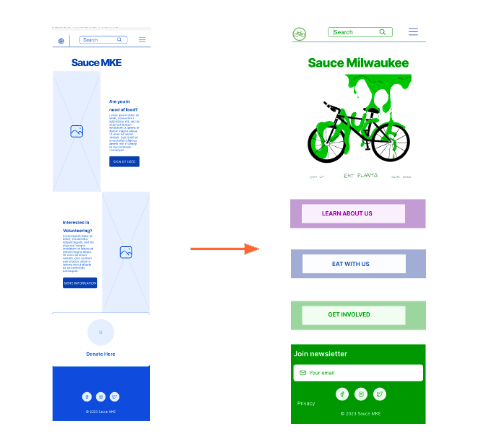
Once round one of reiterations were made, I then consulted with peers for input on usability. No changes to form or flow was suggested or made, but design suggestions were taken into account.
Mockups

High-Fidelity Protoype
Accessibility Considerations

Responsive Design-
-
Information Architecture
-
Responsive Design
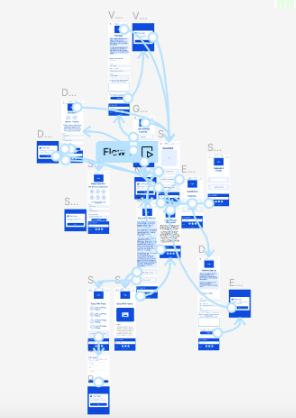
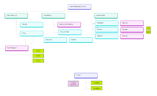
Site Map
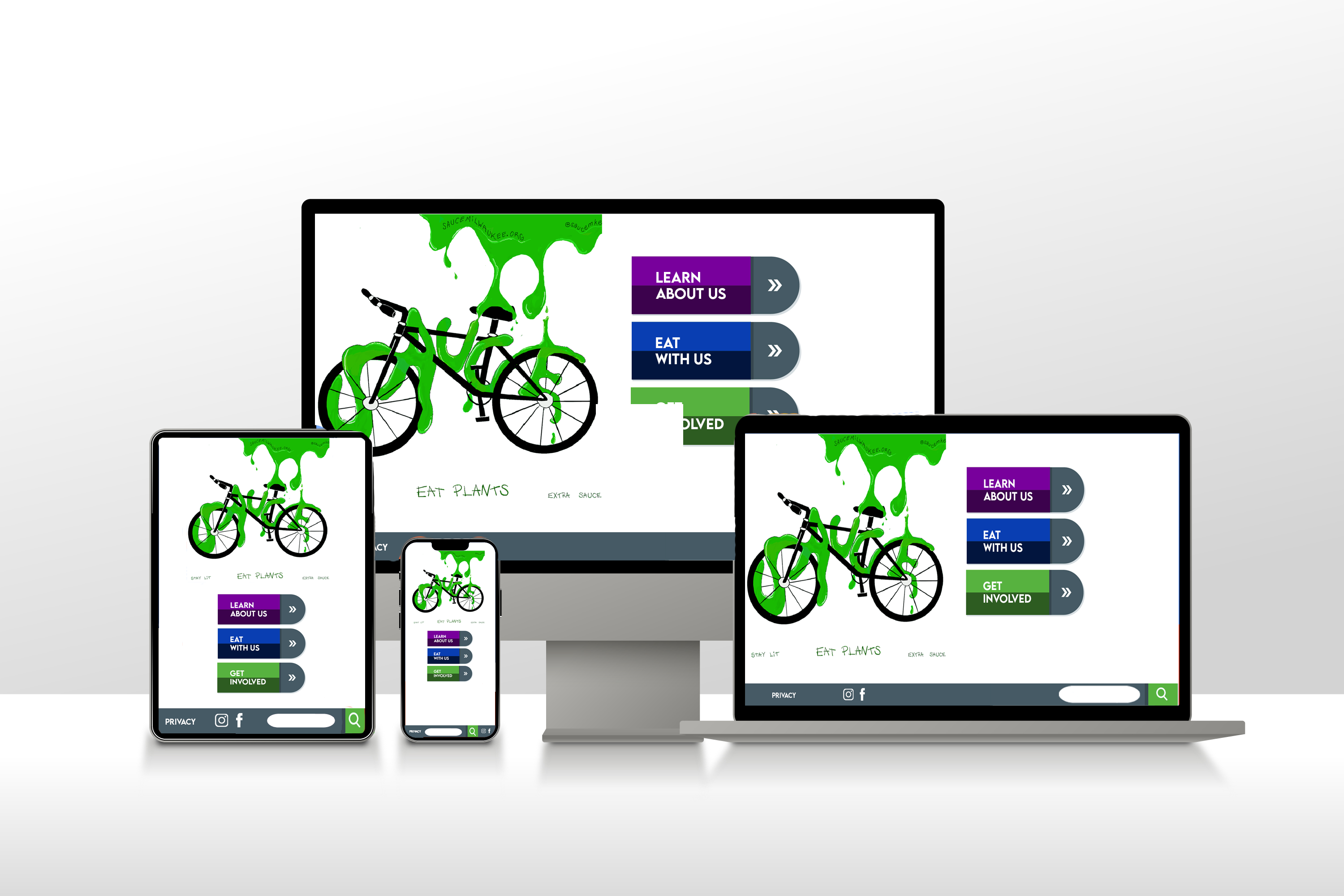
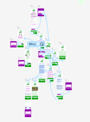
The goal for the website is the same as the app- focus on simplicity and easy navigation.
Responsive Designs
The simplistic design and overly large buttons allow the accessibility to remain clearly intact as the design sizes down.

Going Forward-
-
Takeaways
-
Next Steps
Takeaways
Impact
As this has not been fully developed yet, true quantitative data is not available. From all involved, it is clear it will be of great help to the organization & the people that interact with it.
What I Learned
Working with an actual existing organization gave the truest experience of being a UX Designer yet and I genuinely loved it. I was also reminded that stakeholders/clients may not take your design advice and you need to just roll with it.
Next Steps:


