P.A.W.S.
A website for Plover Animal Welfare Society to help increase adoption rates
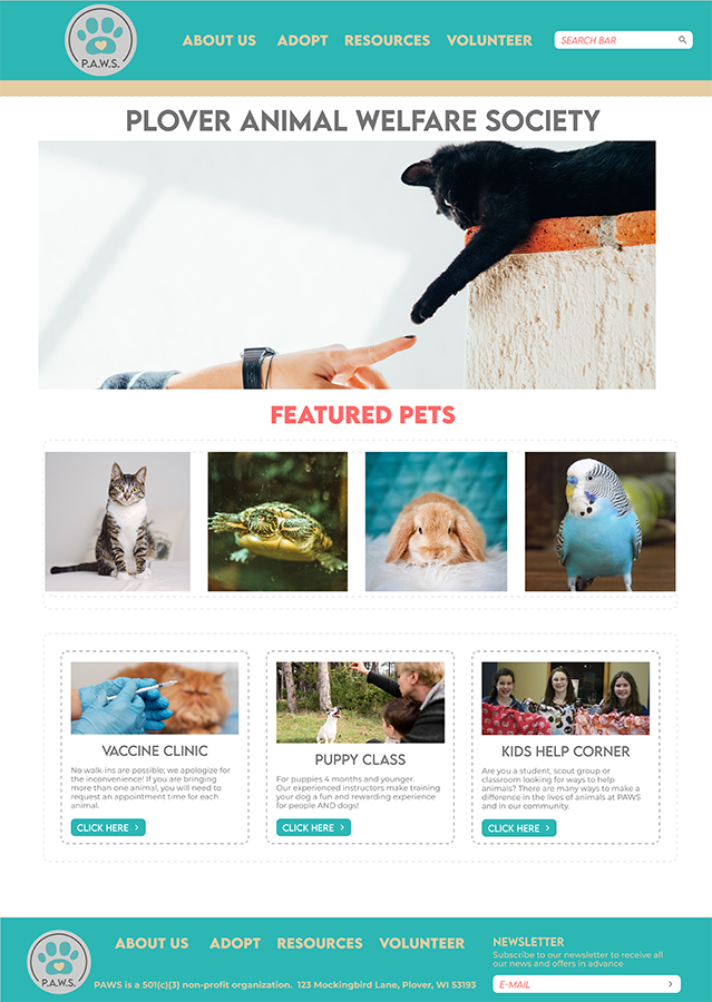
The Product:
Class project prompt: “website for animal shelter to increase adoption rates”
Project Duration:
Approximately two and a half weeks.
My Role:
-
UX Research
-
Information Architecture
-
UX Design
My Responsibilities
-
Planned & conducted user research and competitor analysis.
-
Interpreted data and qualitative feedback.
-
Created user stories, personas, and storyboards.
-
Determined information architecture and created user flow.
-
Created prototypes and wireframes.
-
Conducted usability testing.
-
Finalized high-fidelity prototype.
Overview
Background
As my second project for class, we had the option of doing a matching site to our first case study or picking a prompt. I chose a new prompt to work on starting with a completely black page.
Goals
To design a site that engages potential adopters and clearly lead them through the process closer to adopting the animal of their choice. This will lead to increased adoption rates.
Problem
Current shelter websites typically feature photo and very brief description of adoptable animals but do little more to facilitate the adoption process thereby leading to an increase of adoption rates.
Understanding the User-
-
User research
-
Personas
-
Problem statements
-
User journey maps
Summary
User research was done to gain valuable insights into the needs and expectations of our target users, primarily Emily, the Compassionate Animal Lover, and Mark, the Prospective Pet Owner.
We started with the assumption that our users primarily sought information about available pets for adoption, adoption processes, and upcoming events. However, our research revealed some interesting nuances.
Through surveys, interviews, and usability testing, we discovered that Emily, despite her busy schedule, wanted more engagement opportunities beyond adoption, such as volunteer information and donation options. Mark, on the other hand, emphasized the importance of detailed pet profiles, including information about pets’ behavior and compatibility with children.
This highlighted the need for a comprehensive pet profile system and clarified the significance of easily accessible volunteer and donation sections. The research also emphasized the need for a responsive and user-friendly website design to cater to both personas’ preferences for quick and convenient access to information.
Pain Points:


Limited Free Time
Pain Point: Emily has limited free time due to her demanding job, making it challenging to engage with the shelter’s activities.
Reflection: To accommodate Emily’s time constraints, the website design should prioritize quick access to essential information like adoptable pets and upcoming events, allowing her to stay involved without a significant time commitment.
Complexity
Pain Point: Mark expressed concerns about the complexity of the adoption process and the need for clear instructions and requirements.
Reflection: To address this pain point, the website should include a step-by-step guide to the adoption process, outlining what’s required, ensuring transparency, and alleviating any potential anxiety Mark may have about the process.
Detailed Info
Pain Point: Mark wanted detailed information about the pets available for adoption, especially regarding their behavior and compatibility with children.
Reflection: The pet profile system should provide in-depth information, including temperament, activity levels, and any special requirements, helping make informed decisions about potential pet matches for his family.
Responsiveness
Pain Point: Both personas indicated the need for a responsive website that works well on mobile devices.
Reflection: To address this, the design should prioritize responsive web design principles, ensuring that the website functions seamlessly on various devices and screen sizes, providing a user-friendly experience for all visitors.
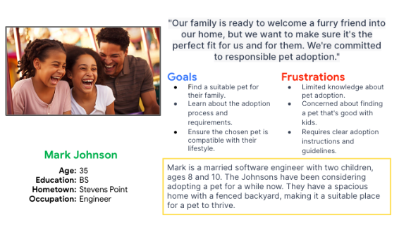
Persona: Mark Johnson
Problem statement:
Mark is a father of two that is looking to add a dog to their home. He needs a responsive website that allows him to learn about adoptable pets online from home as he is new to this process.
User Journey Map
Mark’s user journey map demonstrates how being able to research pets on a website that then allows him to make online reservations to meet the chosen would make his life easier.

Starting the Design-
-
Paper wireframes
-
Digital wireframes
-
Low-fidelity prototype
-
Usability studies
Paper Wireframes
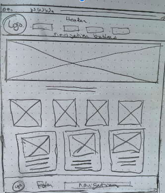
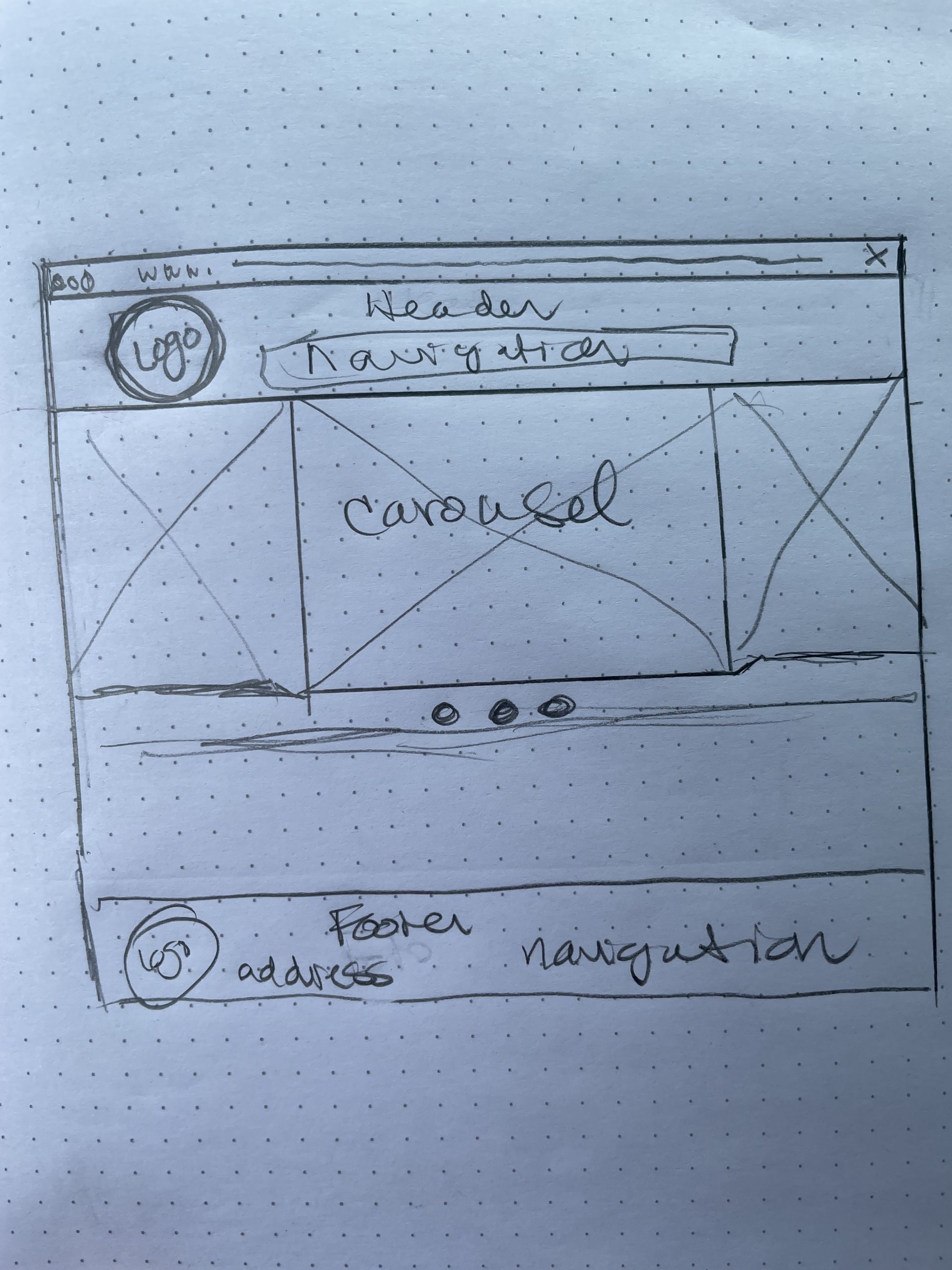
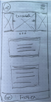
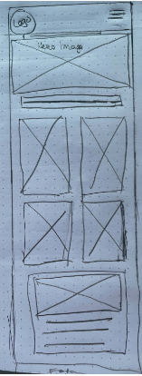
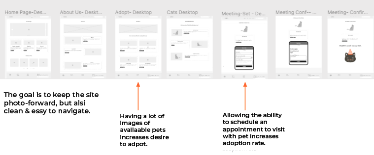
Photos are important when it comes to triggering the desire to adopt a pet. This was the cornerstone of the designs initially sketched for the site. One with a giant Hero image carousel, the other with a Hero image, followed by photos of featured pets and then features with images.
Screen Size Variation(s)
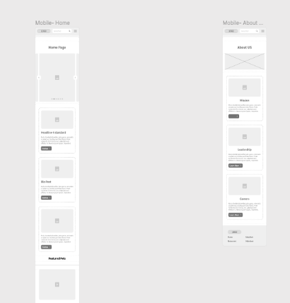
It was the design of the size variations that made clear the direction to go with the site. The Hero image carousel did not lend to the desired goal of the site to draw in adopters. The breakdown of the second version upheld the goal much better.
Site Map
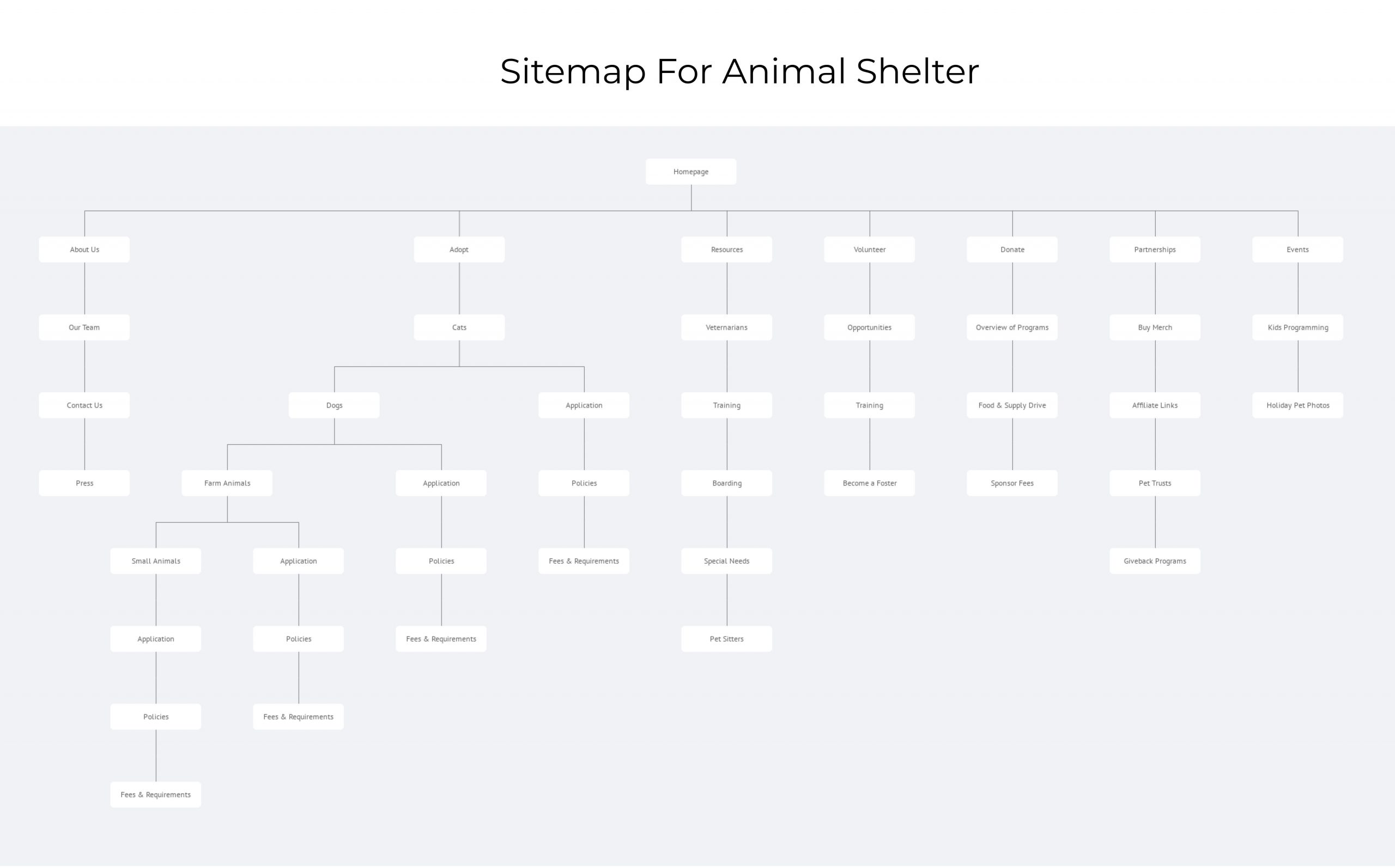
In order to help increase the adoption rates, my goal was to help provide support and information to help potential adopters feel more comfortable with the process.
Digital Wireframes
Screen Size Variations
Initial layouts prior to user input. While it is photo-forward, the Hero image carousel is not effective in this mobile format.
Low-Fidelity Protoype

Usability Study: Parameters
Study type:
Unmoderated usability study
Location:
US, Remote
Participants:
5 Participants
Length:
20-30 minutes
Usability Study: Findings
Refining the Design-
-
Mockups
-
High-Fidelity Prototype
-
Accessibility
Mockups
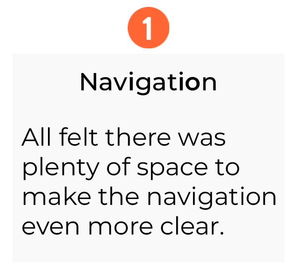
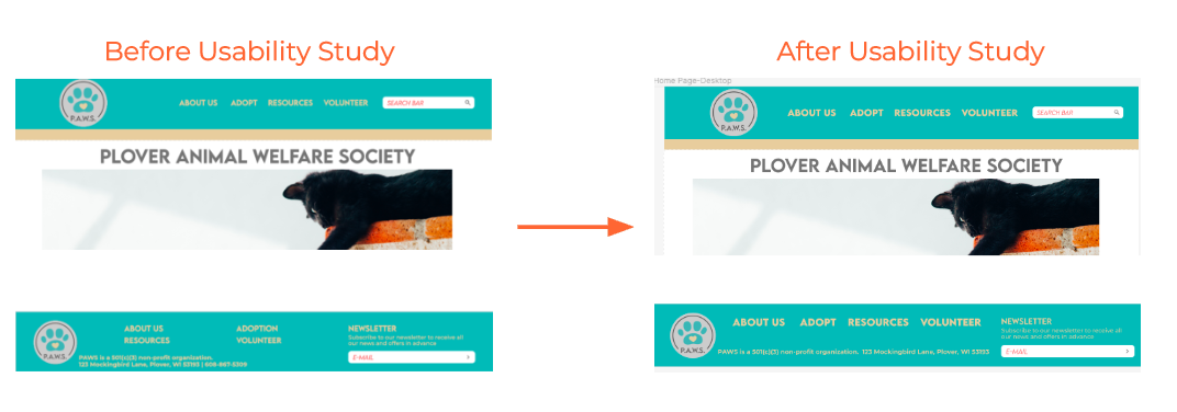
Accessibility is incredibly important to me and, while they felt the navigation was fine, they also pointed out there was plenty of space to make it even bigger and bolder. They were right.
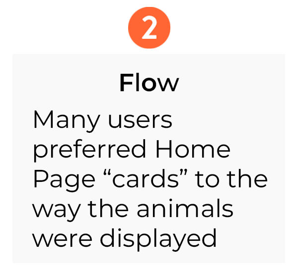
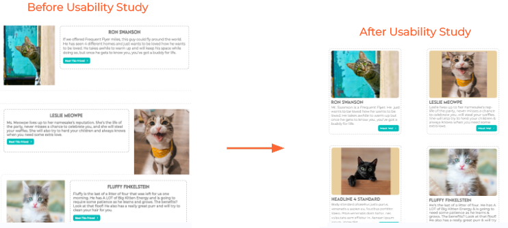
Users thought the layout of the pets may be confusing & liked the “cards”used on the home page.
Mockups: Original Screen Size
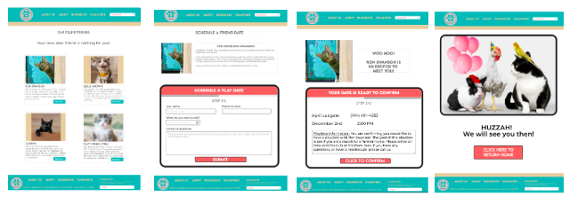
Mockups: Screen Size Variations
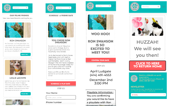
High-Fidelity Protoype
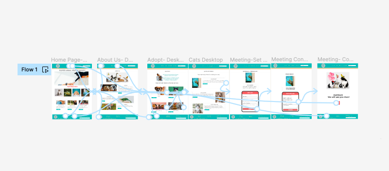
It was important that navigation was easy and clear so there are multiple points of navigation via headers & footers across the site.
Going Forward-
-
Takeaways
-
Next Steps
Takeaways
Impact
With the design, users claimed they were able to form a better connection with their new potential pet and the setting up of a playdate as a next step helped make the whole process of adoption more clear.
What I Learned
The biggest lesson that I learned was that corners should not be cut. Deadlines should be met, yes, but not at the cost of the integrity of the project. It is better to get it right than just get it done.
Next Steps:


