Bean
Mobile App For Tokyo Cafe
The Product:
Class project prompt: “Mobile app for a cafe in Tokyo.”
Project Duration:
Approximately 8 weeks
My Role:
-
UX Research
-
Information Architecture
-
UX Design
My Responsibilities
-
Planned & conducted user research and competitor analysis.
-
Interpreted data and qualitative feedback.
-
Created user stories, personas, and storyboards.
-
Determined information architecture and created user flow.
-
Created prototypes and wireframes.
-
Conducted usability testing.
-
Finalized high-fidelity prototype.

Overview
Background
This project is the very first case study that I ever did and began by choosing a prompt from a prompt generator. A mobile app for a cafe in Tokyo seemed perfect given the six years of Japanese I have studied and my love for coffee.
Goals
My goal was to design an app that is simple for all users to make online reservations and find dietary information before going to the cafe.
Problem
The target users for the Bean cafe mobile face difficulty in being able to accommodate language and dietary needs and reserve tables online to local cafes before going there.
Understanding the User-
-
User research
-
Personas
-
Problem statements
-
User journey maps
Summary
My research for this project included catching up with my former Japanese teacher and friends still in Tokyo to verify the culture surrounding cafes, coffee, and digital presence of both. In addition to this, extensive online research was done, along with a very thorough competitor audit.
Using all the information obtained, personas were created, pain points identified and the needs of what the app should entail formed.
Pain Points:


Languages
Tokyo is a huge international hub and language accessibility is important. Many sites and apps do not offer English options.
Nutritional Info
While it is not common for nutrition to be listed, it is important. One of the personas has dietary allergies.
Online Reservations
Cafes are social nexuses in Tokyo now. People stay, hang out, and often network. Places fill up quickly and do not have online reservations.
Networking
With most cafes offering networking events, but not having them online, it is difficult for people looking to attend to find options.
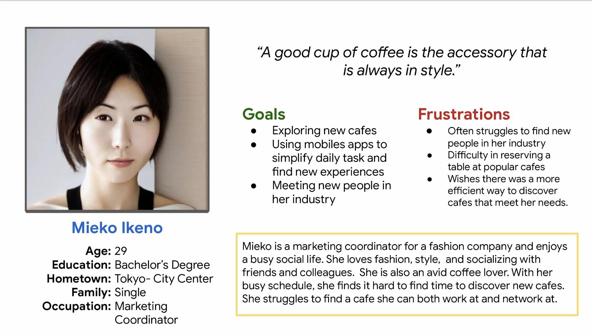
Persona: Mieko Ikeno
Problem statement:
Mieko Ikeno is a
marketing coordinator
and avid coffee lover
who needs to be able to
reserve a cafe table
ahead of time because of
her busy schedule and
table availability.
User Journey Map
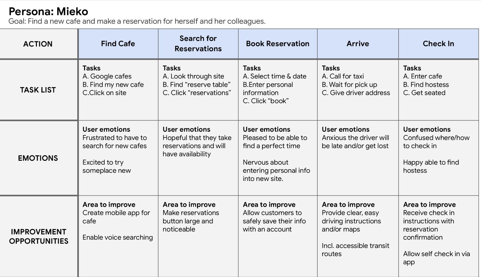
Mieko’s user journey map demonstrates how being able to have an app from a cafe that allows her to make online reservations would make her life easier.
Starting the Design-
-
Paper wireframes
-
Digital wireframes
-
Low-fidelity prototype
-
Usability studies
Paper Wireframes
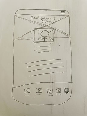
The first paper wireframe for the home screen of the app. It has almost completely changed.
Digital Wireframes
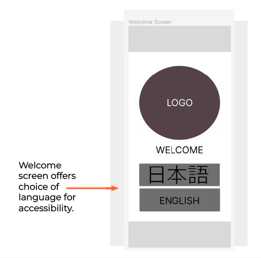
The initial design phase moving
into digital, I made sure to
base screen designs off
findings from the user
research.
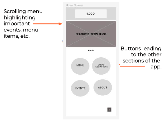
The initial home screen for the
app. The goal was to keep it
clean, and simple, while offer
obvious navigation choices.
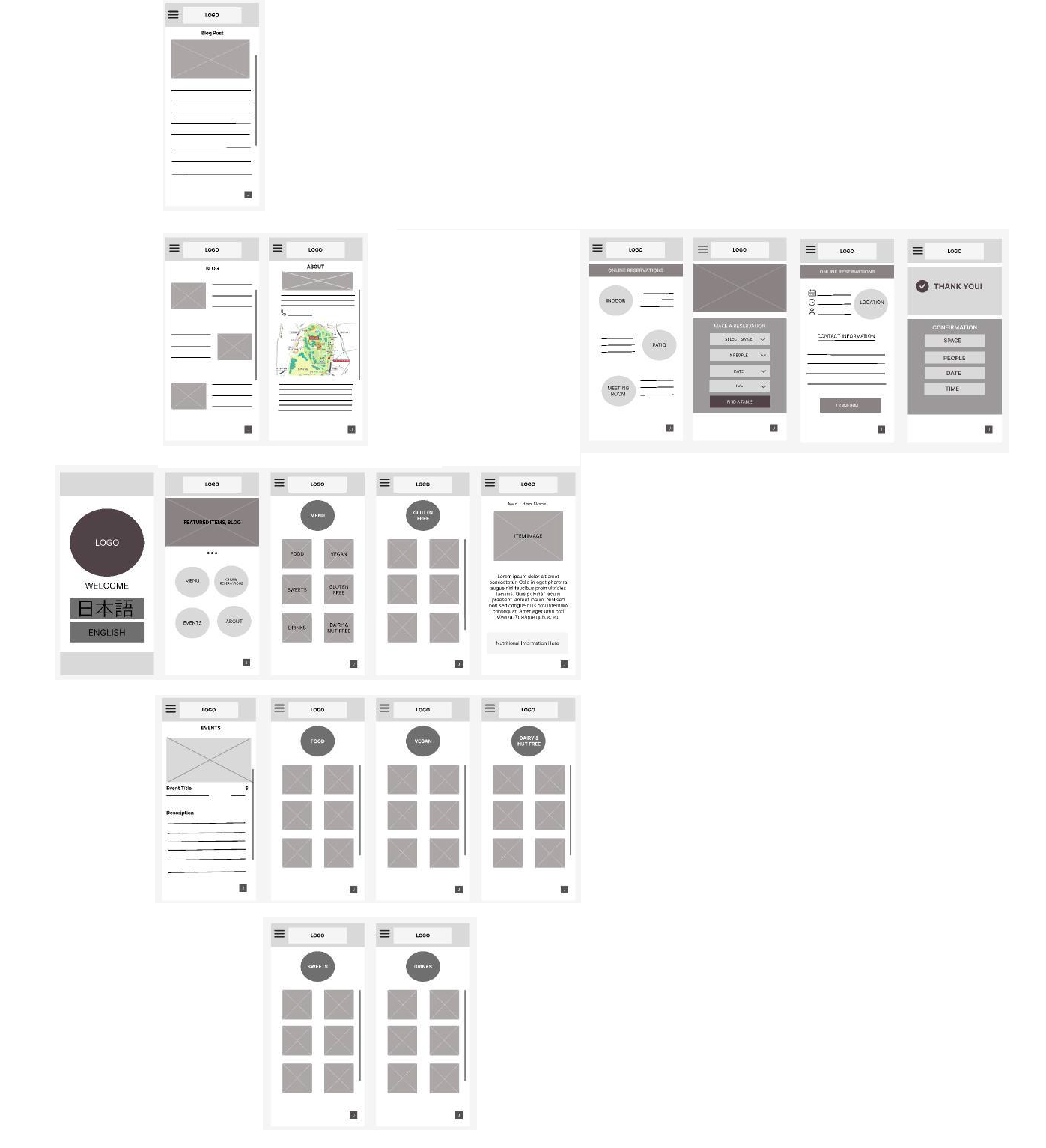
Low-Fidelity Protoype
Initially, the app was significantly bigger with a blog section as well. Rookie overexcitement was strong.
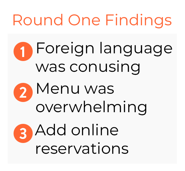
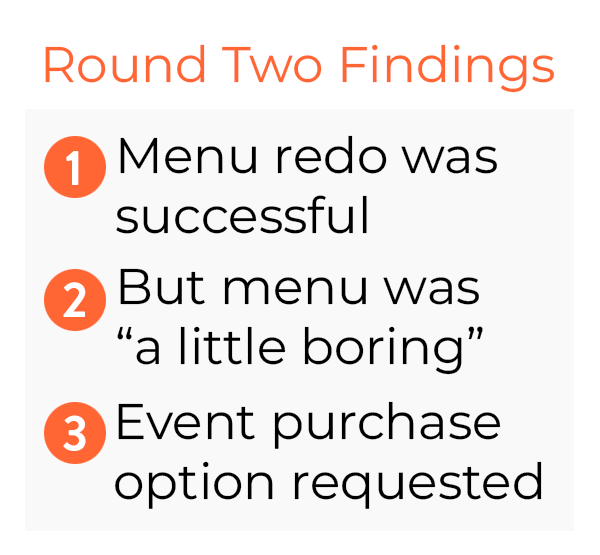
Usability Study: Findings
Overall, I conducted two rounds of usability studies to improve this app. The first round of study helped
me develop the structure for early wireframes, mockups as well as low-fidelity prototype. The second
round of study revealed the areas where my high-fidelity prototype needed improvements.
Refining the Design-
-
Mockups
-
High-Fidelity Prototype
-
Accessibility
Mockups
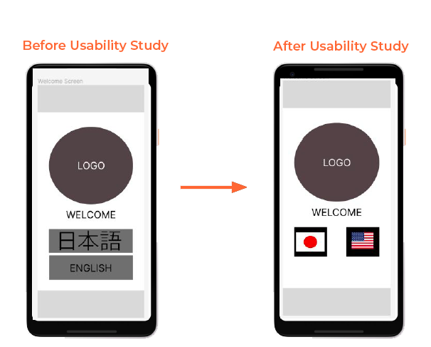
The Usability Study showed English speakers were confused by the presence of Kanji.
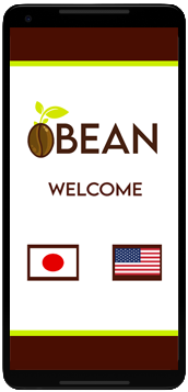
I swapped “English” and the Kanji for “Nihongo” out with the appropriate flag on hello screen.
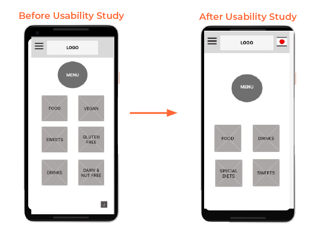
3 out of 5 participants vocalized being overwhelmed by the number of menu choices.
Menus were simplified by creating a “special diets” section that has them neatly sorted.
The box in the lower right with a J in it to navigate over to the Japanese version was swapped with a flag icon and moved to the upper right corner per industry standards.
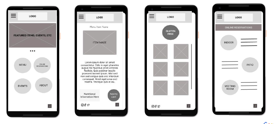
High-Fidelity Protoype
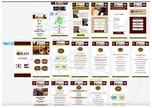
Going Forward-
-
Takeaways
-
Next Steps
Takeaways
Impact
While this project is not live and therefore no data is available, I have spoken with those in Tokyo and the area and a cafe app would be incredibly helpful. With the current generation embracing them more, I foresee apps like mine becoming quite popular soon.
What I Learned
I learned that I love research and wireframing and the whole UX process from start to finish.
I also learned that my connection to both coffee and Japan are parts of me that will always remain important.
Next Steps:


